

Learn How to Build a Custom UI Component Library for Your Angular Project Using Class Variance Authority


In this article, you will learn how to use Class Variance Authority (CVA) to build a custom UI component library in Angular.
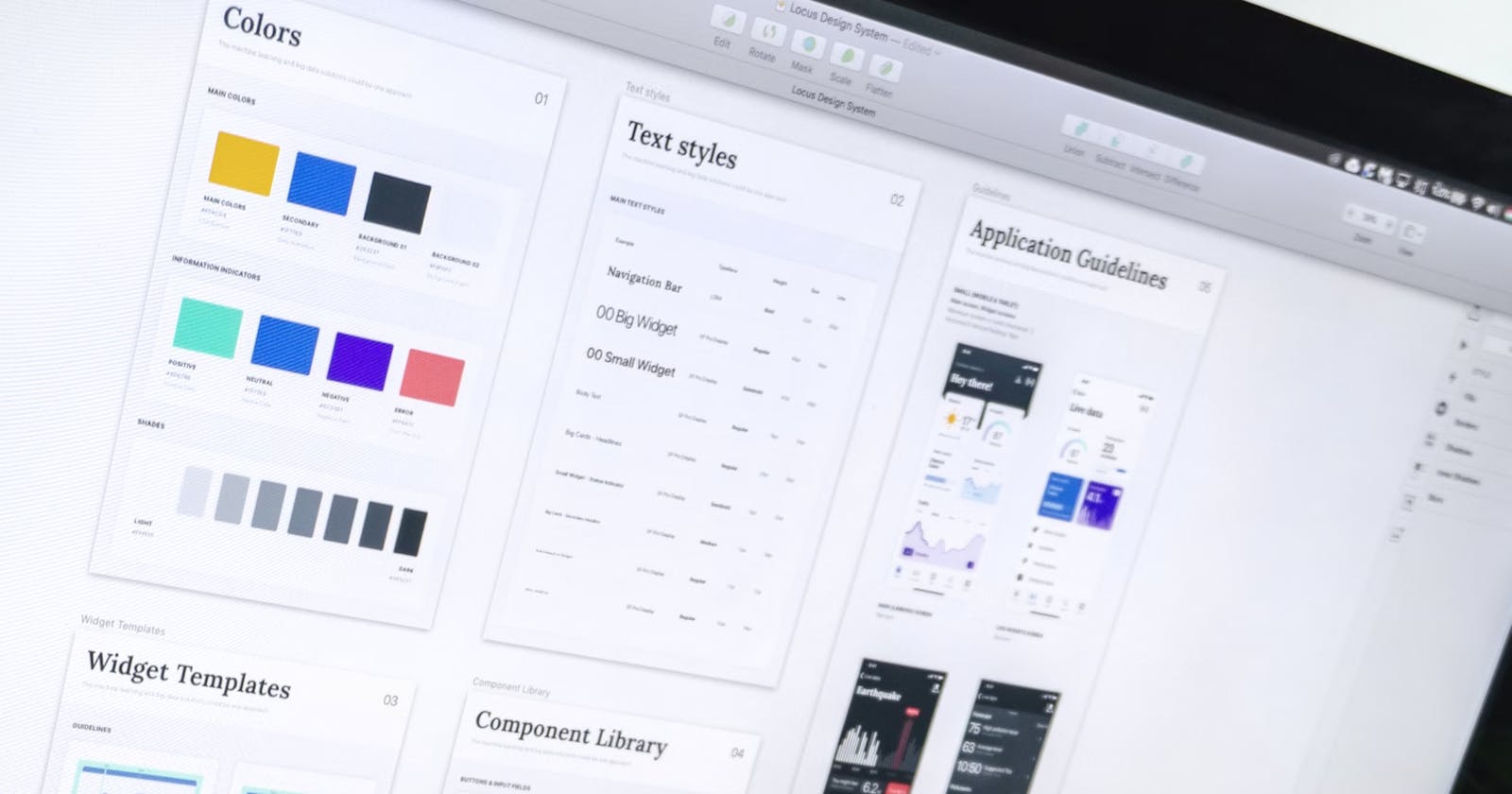
Starting a new web project often means hunting for the perfect UI component library. But then comes the tricky part: customizing it to fit your needs. Theming and adding new components isn’t simple, especially if you’re not fluent in the library’s design language.
Building your UI component library may sound difficult, but it offers the least friction. Plus, some component libraries such as Angular Material offer component development kits (CDK) that ease component development.
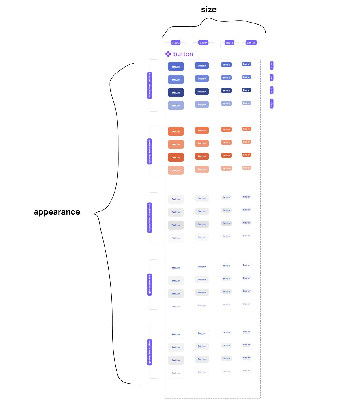
Imagine a designer has provided you with a Figma file containing one component, a button. Your task is to code the button component in Angular. Angular has powerful tools to create custom component libraries, such as view encapsulation and directives. However, we will use CVA to supercharge our component development. Most components, like our button component, have varying designs called variants. Our code would be difficult if we relied on traditional CSS to build these variants. CVA addresses this issue.
Below is a CodeSandbox that you can use as a starter for this lesson.
If you prefer to work locally, spin up a new angular project and follow the guides for CVA and Tailwind CSS. Be sure to install tailwind-merge. While Tailwind CSS is optional, it lets us focus on CVA without veering into CSS tutorial territory. Next, create a button directive. Compared to a component, a directive is preferable here to take advantage of the native button element and prevent adding more DOM elements. This may confuse some, but the key thing to remember is that directives applied to an element can manipulate attributes on that element. In our case, we want our directive to manage the class attribute of the button element.
The first consideration when building a component is the API that will be available to the consumers of the component. When you examine the Figma file provided, you’ll notice that our button component has variants based on size and appearance. We, therefore, need to accept these two values and display a button accordingly.
Therefore our API will be:
<button appButton appearance="" size="">Button</button>
Back to our CodeSandbox, you’ll find an app.component.ts and button.directive.ts file. The button.directive.ts file only has boilerplate code. We shall spend most of our time in this file. The app.component.html file has a button each for the different variants of our button component. We have applied a directive called appButton, the selector of the button directive we created. We also have two additional attributes: appearance and size, which control the variants of our button component. For now, these don’t have any effect. Finally, in the tailwind.config.js file, there is a definition for the color properties used in the Figma file. Let's build our button component.
In the button.directive.ts file, import the cva function from the class-variance-authority library and create a variable named buttonVariants that calls the cva function.
import { Directive } from '@angular/core';
import { cva } from 'cva';

export const buttonVariants = cva();

@Directive({
  selector: '[appButton]',
  standalone: true,
})
export class ButtonDirective {}
The first argument of the cva function is the base, an array of strings that are the default classes for all the variants. The second argument is the config, an object with the properties variants, defaultVariants, and compoundVariants. For this tutorial, our focus is on variants and defaultVariants, but you can read more about compoundVariants here.
Based on the Figma file, all the button components have a border-radius of 12px.
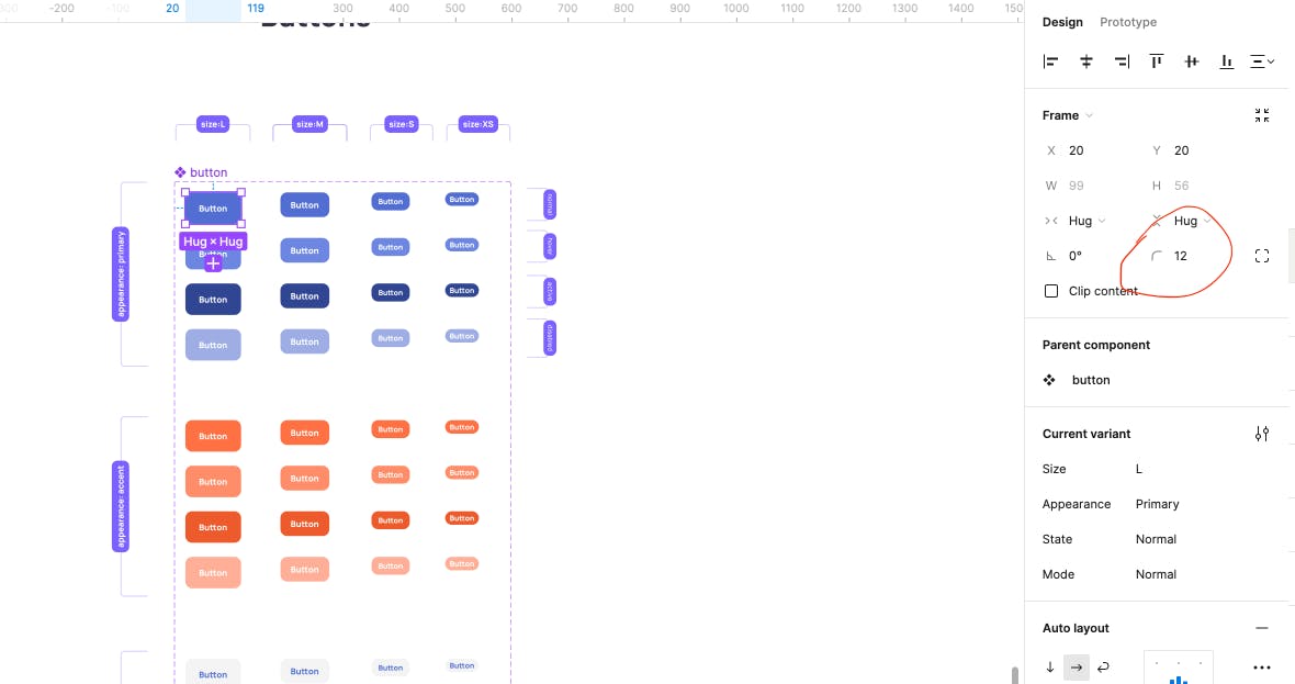
We add the Tailwind CSS block class to turn the button into a block element so that vertical padding can add to the element height.
Next, we define the config object. The variants property is an object that declares the values that can control the variants of our component. In our case, these values are appearance and size.
There are 5 different possibilities for the appearance and 4 for the size. We will define an object for appearance and size whose properties will be the possibilities, and values will be an array of classes. We will add the necessary Tailwind CSS classes to match the design.
import { Directive } from '@angular/core';
import { cva } from 'cva';

export const buttonVariants = cva(['block', 'rounded-xl'], {
  variants: {
    appearance: {
      primary: [
        'text-white',
        'bg-primary',
        'hover:bg-primary-hover',
        'active:bg-primary-active',
        'disabled:bg-primary-disabled',
      ],
      accent: [
        'text-white',
        'bg-accent',
        'hover:bg-accent-hover',
        'active:bg-accent-active',
        'disabled:bg-accent-disabled',
      ],
      secondary: [
        'text-link',
        'bg-secondary',
        'hover:bg-secondary-hover',
        'active:bg-secondary-active',
        'disabled:bg-secondary-disabled',
      ],
      flat: [
        'text-link',
        'hover:bg-secondary',
        'active:bg-secondary-hover',
        'disabled:text-link-disabled',
      ],
      outline: [
        'text-link',
        'border',
        'border-base04',
        'hover:bg-secondary',
        'active:bg-secondary-hover',
        'disabled:text-link-disabled',
      ],
    },
    size: {
      l: ['text-base', 'px-9', 'py-4'],
      m: ['text-base', 'px-6', 'py-2.5'],
      s: ['text-sm', 'px-3', 'py-2'],
      xs: ['text-sm', 'px-1.5', 'py-0.5'],
    },
  },
});

@Directive({
  selector: '[appButton]',
  standalone: true,
})
export class ButtonDirective {}
We need a default button when a user doesn't provide a value for appearance and size. The defaultVariant property of the config object is used to define a default button. In our case, we want a medium-sized primary button as our default.
import { Directive } from '@angular/core';
import { cva } from 'cva';

export const buttonVariants = cva(['block', 'rounded-xl'], {
  variants: {
    appearance: {
      primary: [
        'text-white',
        'bg-primary',
        'hover:bg-primary-hover',
        'active:bg-primary-active',
        'disabled:bg-primary-disabled',
      ],
      accent: [
        'text-white',
        'bg-accent',
        'hover:bg-accent-hover',
        'active:bg-accent-active',
        'disabled:bg-accent-disabled',
      ],
      secondary: [
        'text-link',
        'bg-secondary',
        'hover:bg-secondary-hover',
        'active:bg-secondary-active',
        'disabled:bg-secondary-disabled',
      ],
      flat: [
        'text-link',
        'hover:bg-secondary',
        'active:bg-secondary-hover',
        'disabled:text-link-disabled',
      ],
      outline: [
        'text-link',
        'border',
        'border-base04',
        'hover:bg-secondary',
        'active:bg-secondary-hover',
        'disabled:text-link-disabled',
      ],
    },
    size: {
      l: ['text-base', 'px-9', 'py-4'],
      m: ['text-base', 'px-6', 'py-2.5'],
      s: ['text-sm', 'px-3', 'py-2'],
      xs: ['text-sm', 'px-1.5', 'py-0.5'],
    },
  },
  defaultVariants: {
    appearance: 'primary',
    size: 'm',
  },
});

@Directive({
  selector: '[appButton]',
  standalone: true,
})
export class ButtonDirective {}
We need to accept the appearance and size properties in our button.directive.ts file. CVA provides a utility function called VariantProps that returns the type of our variants.
Finally, we can use a computed signal to compute the class to be applied on the button and use tailwind-merge to handle any styling conflicts. We then bind to the class attribute of the button element by using the host metadata and passing the computed signal. This finishes our button component.
import { computed, Directive, input } from '@angular/core';
import { cva, VariantProps } from 'cva';
import { twMerge } from 'tailwind-merge';

export const buttonVariants = cva(['block', 'rounded-xl'], {
  variants: {
    appearance: {
      primary: [
        'text-white',
        'bg-primary',
        'hover:bg-primary-hover',
        'active:bg-primary-active',
        'disabled:bg-primary-disabled',
      ],
      accent: [
        'text-white',
        'bg-accent',
        'hover:bg-accent-hover',
        'active:bg-accent-active',
        'disabled:bg-accent-disabled',
      ],
      secondary: [
        'text-link',
        'bg-secondary',
        'hover:bg-secondary-hover',
        'active:bg-secondary-active',
        'disabled:bg-secondary-disabled',
      ],
      flat: [
        'text-link',
        'hover:bg-secondary',
        'active:bg-secondary-hover',
        'disabled:text-link-disabled',
      ],
      outline: [
        'text-link',
        'border',
        'border-base04',
        'hover:bg-secondary',
        'active:bg-secondary-hover',
        'disabled:text-link-disabled',
      ],
    },
    size: {
      l: ['text-base', 'px-9', 'py-4'],
      m: ['text-base', 'px-6', 'py-2.5'],
      s: ['text-sm', 'px-3', 'py-2'],
      xs: ['text-sm', 'px-1.5', 'py-0.5'],
    },
  },
  defaultVariants: {
    appearance: 'primary',
    size: 'm',
  },
});

export type ButtonVariants = VariantProps<typeof buttonVariants>;

@Directive({
  selector: '[appButton]',
  standalone: true,
  host: {
    '[class]': 'computedClass()',
  },
})
export class ButtonDirective {
  size = input<ButtonVariants['size']>();
  appearance = input<ButtonVariants['appearance']>();

  computedClass = computed(() => {
    return twMerge(
      buttonVariants({ appearance: this.appearance(), size: this.size() }),
    );
  });
}
This wraps up this tutorial on using Class Variance Authority to build custom UI components in Angular.